Premium quality nuts: almonds, cashews, macadamia even, drizzled with flavour and packaged as per the clients’ taste makes Nuts and Crackle one of its kind. The brand strives to attain lucidity not only in design but also choice and variation.
‘Crafted with simplicity’ being the basis of the approach towards design and packaging, Nuts and Crackle holds its identity in its lucid nature. A nut within an imperfect pastel circle was perceived from the idea of having premium quality nuts barring the sophistication and yet standing above the bar by a notch.
PRIMARY TYPEFACE ABRIL DISPLAY
The casual element introduced in the fonts depicts the ‘customised gifting, yet easy on the pocket’ approach of the brand.
SECONDARY TYPEFACE HELVETICA NEUE
PRIMARY COLOR PALETTE
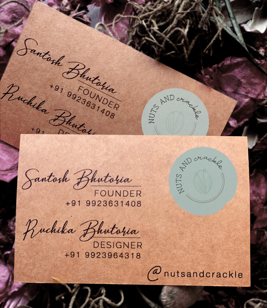
BUSINESS CARD
Right from the product, to the packaging and marketing, ‘handcrafted’ sings its way through. Glass jars personalised to your content packed in paper boxes along with notes and business cards printed on handmade paper, Nuts and Crackle serves you handcrafted everything.
Handcrafted with love and care, Nuts and Crackle reflects approachability in its distinct, pastel and simple design. An easy gifting idea born out of premium quality nuts and dry fruits in varied flavours.